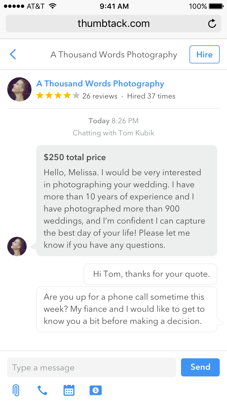
Thumbtack Messenger

Thumbtack is a marketplace for finding and hiring the right pro for every project. I designed the messaging-centric customer experience, which boils Thumbtack down to its essential value: quickly and conveniently connecting customers with professionals that want to be hired. In addition to design, I conducted user interviews and testing, created prototypes, and worked with engineers as they built the final product to ensure consistency with the designs and a high level of polish.

This experience led to double-digit gains in core metrics.
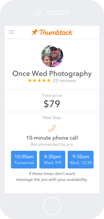
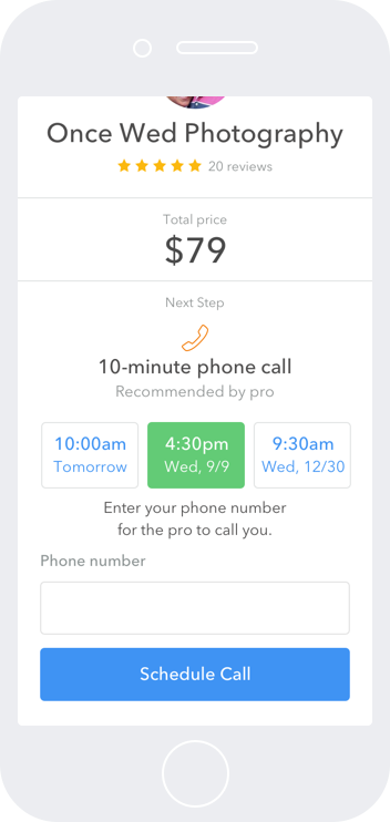
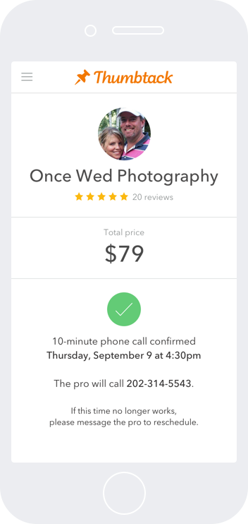
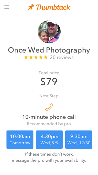
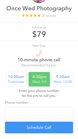
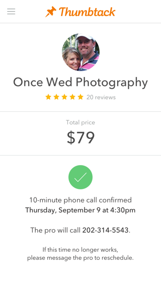
Thumbtack Scheduling Service

Scheduling meetings is a pain—and often requires several rounds of messages back and forth to find a time that works for everyone. Thumbtack wanted to save our customers and pros precious time, so I designed an MVP scheduling service, leveraging Thumbtack’s pattern library to create a straight-forward UI. After conducting user research and iterating, we launched nationwide, and I handed responsibility for the service over to a colleague, who continued to improve and expand on the MVP.

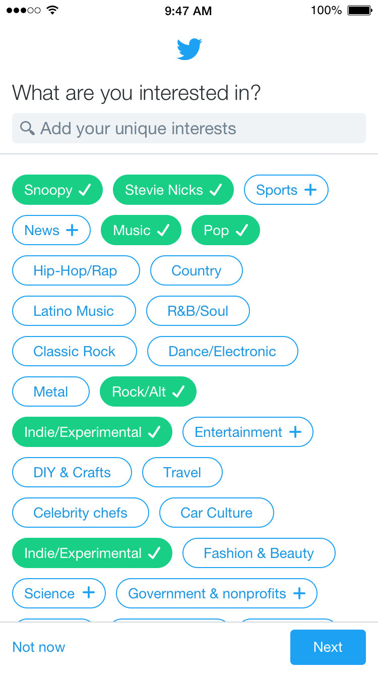
Twitter Topic-based Onboarding

New members of Twitter face an uphill battle when trying to find people they want to follow. To make the communities they want to join more easily accessible, I designed a topic-based onboarding experience. After telling Twitter about things you’re into, the app suggests people to follow who tweet about the all stuff you like.

This project helped new users better engage with their communities: new and mutual follows increased by 30%, and time spent in-app also went up—all key indicators that a person would become a dedicated Twitter user.

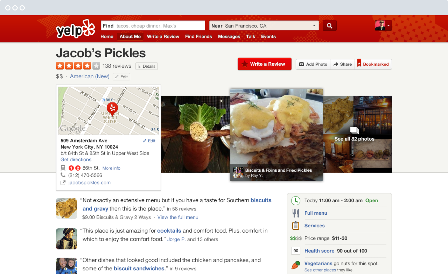
Yelp Business Page

I led design for Yelp.com, and re-designed the business page to be an immersive and engaging experience that tells the story of what it’s like to go to a restaurant or work with a plumber. By surfacing the right information at the right time, and highlighting Yelp’s user generated photos and reviews, the design increased engagement with reviews by 13%, and created a 6% increase in local ad click-throughs (Yelp’s primary source of revenue). Many of the patterns in the design have been adopted by Yelp’s competitors.

I wrote a popular article on Medium detailing many of the design decisions that went into the work.

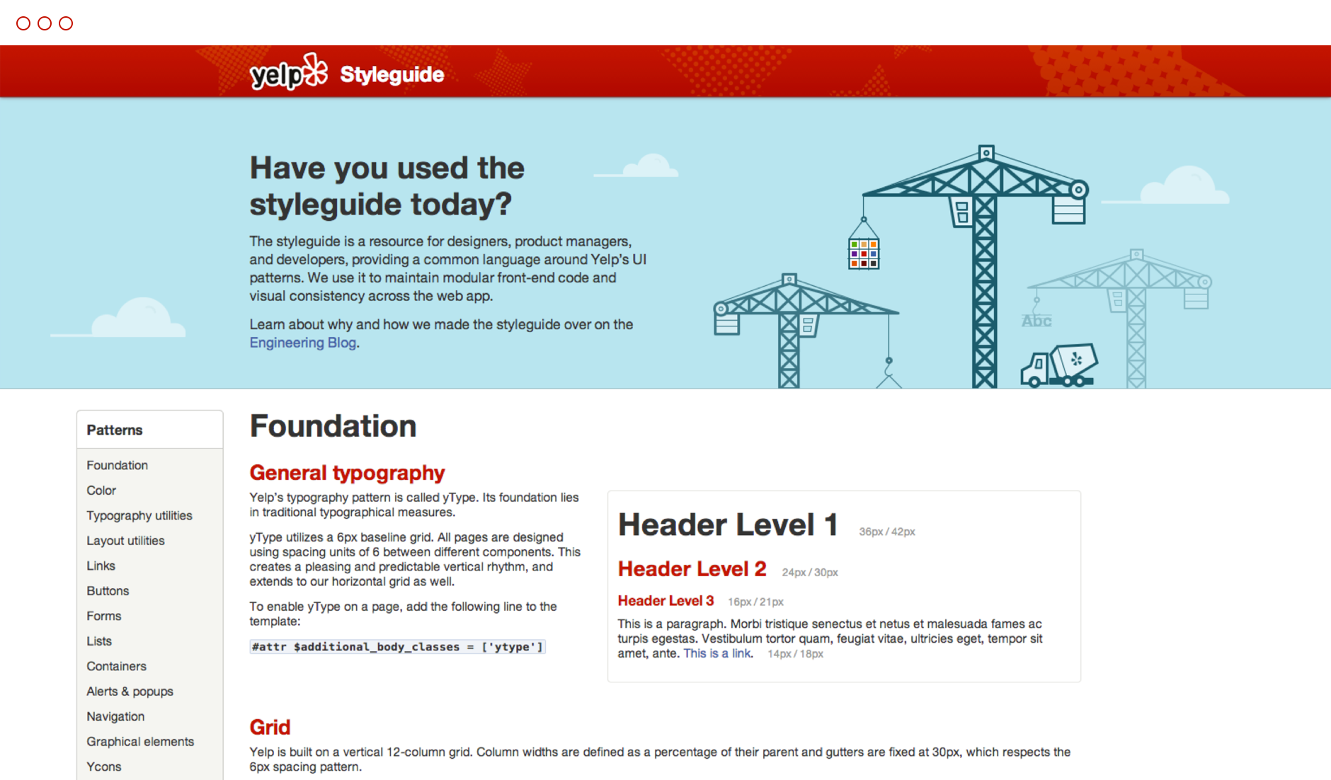
Yelp Styleguide

The business page redesign necessitated many improvements across the site, including new global navigation and footers, more readable type, and a refined color palette. To help ensure consistency across the entire product, I worked with front-end engineering to author a definitive, living styleguide. Modular and componentized, it sped up both design and development, and became an essential communications tool, ensuring product managers, designers, and engineers were all speaking the same language.

The Yelp Styleguide is still in active development today, and has been lauded by A List Apart. I also authored an article about the Styleguide on Medium.

A little more about me

I hail from the East Coast, where I started my design career in the agency world and earned an MFA in Interaction Design from the School of Visual Arts in New York. Through my coursework, I dabbled in animation, app design, augmented reality, business theory, coding, environmental design, infographics, prototyping, and service design. My thesis explored the power of handwriting in an increasingly digital world. Given the broad range of topics, I half-jokingly referred to my degree as an MFA in Hustle.

I love working on big, complex problems, and I’m fascinated with the intersection of real life and internet. Besides designing products, I love my wife Amy, our dog Mac, rock climbing, bike riding, and all kinds of noodles.

You can find me all over the internet as @allisonacs.